Colours for Autumn Packaging
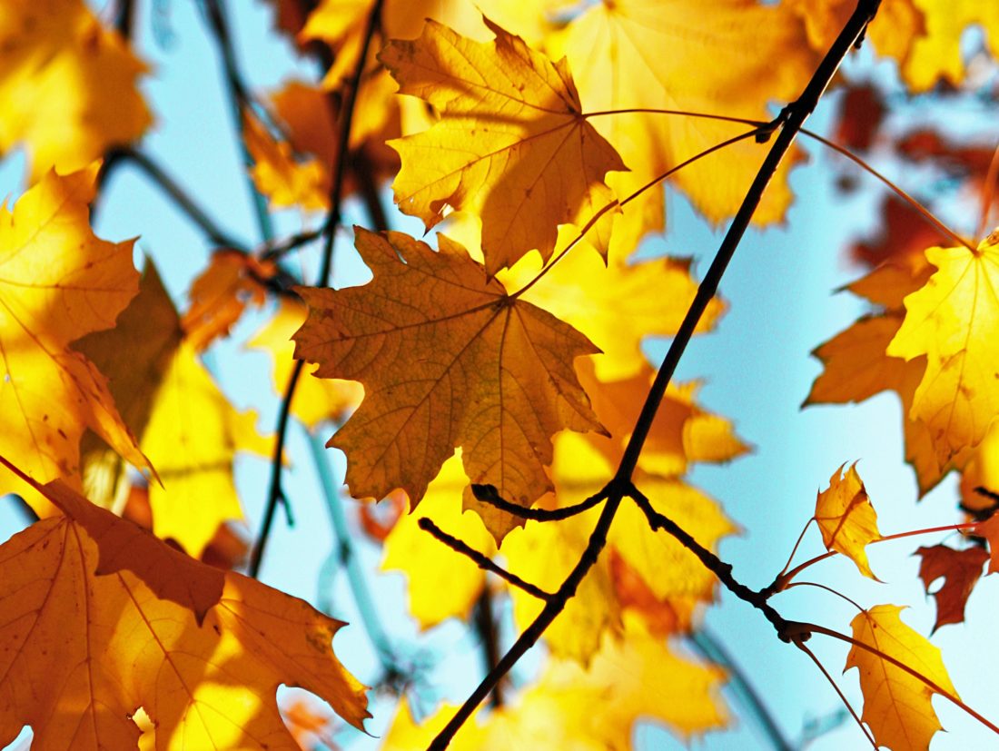
One of the highlights of the season is the changing colours of leaves. A trip to many of the UK’s woodlands can be spectacular at this time of year, as they are filled with rich and earthy colours. Reflecting these changing tones in nature, we see an influx of khaki, burgundy, terracotta and yellow designs at this time of year. If you have embraced these colours on your autumn packaging, what are the colour associations?
What are Colour Associations?
Humans have always used colour as a means of identification. For example, the colour of fruits indicates whether they are ripe and safe to eat. Equally, the colour of certain insects acts as a warning that they are poisonous. Over Centuries of exposure to colour, we have developed emotional responses to specific hues.
This psychological perception of colour and meaning has been reinforced by designers who have used it in fashion, interiors and packaging. Now, we are surrounded by more shades than ever before and we still use them as a means of filtering and categorising what we see.
For this reason, selecting the colour palette for your packaging design is more than just picking your favourite tone. It is wise to research and understand the qualities that are associated with your choice and how that influences the perception of your product and brand.
Perception of Autumn Colours
To get you started, we want to share some of the qualities attributed to Autumn colours.
Khaki Green
This deep, brownish-green is a very earthy and harmonising colour. It is a deep, yet neutral tone that blends well with almost every other shade. Due to its use in camouflage wear, it is also associated with the military and formality.
Burgundy
The deep, rich tones of dark red are connected with wealth and prosperity. It is an elegant colour that has been used in classic, luxury packaging. In addition, this colour is associated with regalia and so implies ambition, power and high status.
Terracotta
Terracotta is derived from clay pigments in the soil, so it’s a natural, earthy tone. The muted orange instantly connects us with warm, calm, cosy and serene feelings. The colour is also associated with nourishment and nurturing.
Golden Yellow
The colour of sunshine, golden yellow evokes positivity, optimism and inspiration. This year, we are also seeing a lighter, buttery yellow in the design trends. This is usually associated with Spring, growth and fresh opportunities.
Colour Matching for Packaging Design
Once you’ve decided on colours that fit your brand and product, you want them consistently represented across your packaging and promotions. For this reason, we use both Pantone® Matching System (PMS) and CMYK colour-matching system to accurately reproduce tones.
In addition, we have a dedicated colour-mixing facility on site. This enables us to create smaller batches of specified shades for use on low-volume runs. Mixing to order has enabled us to minimise waste and make printed packaging more cost-effective for customers.
We also offer a choice of print techniques and finishes to achieve the perfect solution for your boxes and budget. To get our advice on printed cardboard packaging, along with a quote and sample, give us a call 01296 436888 or email enquiries@abcbox.co.uk
To find out more about colour associations, Dr Vien Cheung, Associate professor at Leeds University has written this article:
https://spotlight.leeds.ac.uk/worldchangers/colour/index.html
Countryfile shares some of the best places to see the natural beauty of Autumn:
https://www.countryfile.com/go-outdoors/days-out/best-places-in-britain-to-see-autumn-colours


Sorry, the comment form is closed at this time.