At this time of year, it seems that everything is a bit grey. Therefore, we need something to lift our spirits and inject a bit of colour into the world. So, in this article, we explore the colour yellow and its use in creating eye-catching printed packaging.
What Does Yellow Represent?
Yellow is a colour of positivity, happiness and confidence. In addition, seeing the colour yellow is known to stimulate mental activity and optimism. It grabs our attention and makes us feel optimistic. Therefore, you are likely to see yellow in the printed packaging of fun and joyous brands.
Check out some brands that have embraced yellow on this Pinterest board.
Yellow is often used to represent spring as it symbolises new life, hope and youth. Many of the first flowers to appear after the winter are vibrant yellow, including daffodils, primroses and some tulip varieties. And, of course, yellow is the colour of sunshine. This can make it ideal for seasonal designs on printed packaging.
The ability to grab our attention means that yellow is also used as a warning. Hazardous products, safety warnings and anything that demands caution typically feature the colour. As such, we have created yellow printed packaging for medicinal products.
Tones of Yellow
When it comes to printed packaging, pure yellow is Hex code #FFFF00 or CMYK 0 0 100 0, but yellow isn’t always this vibrant. It can be represented in different variations including:
- Calming creamy, buttery shades
- Indulgent golden hues
- Fresh and zesty yellowy-green
- Warm orange tones
- Natural and earthy ochre
As such it can be an appropriate colour for a range of brands and products.
Does Yellow Print Show Up on Cardboard?
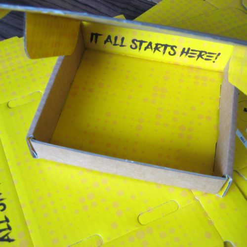
As the base colour for all cardboard boxes is either kraft brown or white, many customers ask if yellow shows up on this background. We think that the illustration accompanying this article answers that question!
Having said this, there is a subtle definition between colours when you use orange or ochre tones on brown boxes. Therefore, we advise a white base to increase the visibility of your branding. Equally, the contrast between white and creamy yellow is minimal. That might be the effect that you desire on your printed packaging, but if not, opt for brown boxes.
If you select a two-colour print, then other bright primary and secondary colours (red, blue, orange, green and purple) create an upbeat, child-friendly feel. Meanwhile, navy, grey and black balance the yellow and tone it down, which can create quite a sophisticated look.
We supply all customers with a sample of their printed packaging. So, if you aren’t sure how colours will work on packaging, you can check that you are happy. If not, we can alter the tone and the contrast before placing an order.
Internal Printed Packaging
The packaging design shown in the illustration is internal printed packaging. The outside of the box is relatively plain. It is when the box is opened that customers are hit with this bolt of energising colour. It’s like opening a pot of gold, which offers a positive unboxing experience that is instantly associated with the product and brand. Is this the sort of impact that you’d like to have on your customers?
Printed Packaging Advice
We provide a full range of finishes, from cost-effective flexographic to gloss or full shine print. If you have ideas about the look you want to achieve, our team are happy to offer advice. We support plenty of customers with no prior knowledge of packaging and guide them through the process.
If you have any questions, contact us on 01296 436888 or enquiries@abcbox.co.uk.

