Colour is widely used to add appeal to retail and e-commerce packaging. It also builds brand familiarity and helps to communicate company values. So what do you need to know about printed packaging to achieve the desired finish?
How to Achieve Colour Consistency on Printed Packaging
Contemplating the right brand colours is a minefield. You need to be aware of colour psychology and instinctive associations that we have about every tone. The colour has to reflect your company values and evoke an emotional response to your brand. Your inspiration may be linked to tradition or driving innovation. So, when you come to a conclusion and present the final colour palette, you want this to be consistently represented in every representation of your brand.
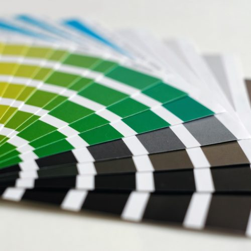
To take the guesswork out of design, two universal colour-matching systems are used for printed packaging:
- Pantone
- CMYK (Cyan, Magenta, Yellow & Black)
In both systems, every shade has a code, which represents the spot colour. If you provide designers with the codes for your brand colours, you can be sure that the exact match will be made.
Some print processes only use Pantone or CMYK, but conversion tools help designers switch to the desired format.
Colour Mismatch
Have you ever noticed a disparity between a document on your computer screen and what comes out of the printer? That is because the colours on a screen are formed from pixels using digital RGB. Therefore, don’t panic if the designer is using your specified Pantone or CMYK, but they don’t look right on in a digital image.
To give you confidence that your printed boxes will match, we provide samples before you finalise your packaging order.
Printed Cardboard Packaging
There are two standard base colours for printed cardboard packaging, kraft brown or white. The brown base does alter the shade of the print and this can be used to great effect. However, if you want to maintain the true tone of your brand colours, we recommend specifying a white base.
Our team are knowledgeable about print options and finishes. If you have questions about whether lithographic or flexographic is best for your boxes, or how to achieve a good matt or gloss finish, just call us 01296 436888. We can also advise on the most cost-effective solutions.
Top Tip: To keep the cost of printed packaging down, ask your designers to use just one or two colours. They can consider how to integrate the white base colour to add an extra dimension.
Sustainable Printed Packaging
Many customers ask about the environmental impact of printing boxes. Firstly, we are committed to water-based inks which minimise chemical use. Secondly, we have an in-house ink kitchen for colour mixing, enabling us to prepare just what is needed for a print run. Along with controlled processes, this ensures we minimise waste.
Finally, our inks are fully recyclable and do not impact the recyclability of cardboard packaging.
Pantone Colours for 2024
There are around 2390 Pantone colours that can be used on printed boxes, textiles, marketing materials and more. Pantone selects a Colour of the Year, which reflects the current mood and trends. In 2024, 1023 Peach Fuzz takes centre stage. Described as soft, warm and enriching, it is well suited to interior homeware and beauty products and packaging.
If this isn’t a tone that resonates with your brand, you might take an interest in Pantone’s Autumn Winter 2024/25 collection. This palette of 15 nature-inspired shades includes:
- Deep, dark tones of Evening Blue, Eggplant, Iguana & Dark Shadows
- Vibrant, tropical tones of Cherry Tomato, Wave Ride & Misted Yellow
- Subtle, pale tones of Starlight Blue, Almond Milk & Sheepskin
These ‘on trend’ colours feature in London Fashion Week’s Autumn Winter collection, so expect to see them pop up in your favourite clothing stores, as well as in printed packaging design.
Seasonal Colours & Limited Edition Packaging
Once we have set up the design for your retail packaging or e-commerce shipping boxes, it is relatively straightforward to alter the colours. This offers the option of retaining consistency with design, but switching up the colour for a seasonal twist or limited edition range.
With a dedicated on-site facility, we offer competitive prices and lead times for printed packaging. Get in touch to discuss your requirements and get a quote; 01296 436888 or enquiries@abcbox.co.uk