
Iconic Packaging Design
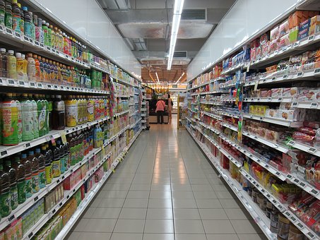
On a packed supermarket shelf, how do shoppers decide what to buy?
There are certain branded products that have been supermarket staples for years. As consumers, we’re so familiar with the packaging design that it takes little more than a glance to know what we’re placing into our trolley.
Packaging Shape
We recognise some brands by the shape of the packaging. The triangular Toblerone box reflects the Swiss Alps and the curves of a Coca Cola bottle are said to be inspired by the cocoa bean. Pringles used cardboard tubes to save their crisps from being crushed and the ‘love it, hate it’ debate has little to do with the iconic shape of the Marmite jar. If all labels and printing was removed from these items, the majority of consumers would still recognise the brand.
Colour in Design
In other examples, we are familiar with the colour. Teal isn’t a colour widely used in food packaging, so a Heinz Baked Beans tin is easily identifiable on the shelf. Spot a rich purple in the confectionery aisle and you know you’re looking at a Cadbury’s chocolate bar.
Colour is also used to help shoppers to quickly find our preferred variety within a product range. Milk tops are a great example; do you opt for blue, green or red? We also recognise that Red Oxo Cubes are for meat dishes, green for vegetarian and yellow for chicken.
Changing the Colours
To keep pace with modern tastes, the majority of retail packaging will be regularly updated. When your brand is so well known, the process of change is tricky. Shoppers are drawn to the familiar design, so any updates have to hold onto the essence of the brand.
The design of Heinz Soup has remained unchanged since the first can was produced over 100 years ago, but all that is about to change. The company have worked in collaboration with Cath Kidston to create limited edition packaging. Three varieties of soup – Tomato, Chicken and Vegetable – are having a temporary upgrade.
The special cans retain the recognisable Heinz branding, but come with a Cath Kidston vintage twist. With only a short run being produced, it is expected that these cans will attract the interests of packaging collectors. Each tin will be sold in major UK supermarkets for £10 and a three can collector’s box will also be available. All profits are being donated to The Trussell Trust, to help fund food banks in the UK. If you are only interested in the contents, standard tins will still be on sale at the usual retail price.
Limited Edition Packaging
Retail packaging design can make all the difference to how your product is perceived. Could your product range benefit from collaboration with a local or iconic designer help to attract attention and publicity? When it comes to Corporate Social Responsibility, is this a good way to raise funds for a charity of your choice?
Whether you are launching a new range, looking to upgrade your existing packaging, or wish to create a limited edition version, Aylesbury Box Company can assist. Our experienced team can guide you through the design process, advise on materials or print and manufacture retail packaging to your specific requirements. Give us a call on 01296 436888 to start the discussion.
Sorry, the comment form is closed at this time.