
Black and White Packaging Design
Printed packaging is often bursting with colour. Rich, bright or subtle tones help to communicate a message and ensure that your goods look eye-catching on the shelf. What’s more exact colour matching can align your packaging with your branding.
With so much going for coloured packaging design, why would any company opt for black and white print?
Black and White Printed Packaging
Every colour provides us with visual information. We associate particular tones with certain characteristics and this instantly provides us with information on the product inside the box.
It’s no different for black and white.
- Black Packaging
Black is seen as strong, professional, mysterious, dark and sophisticated. It is also linked to the night and evil. Masculine products are often displayed in black packaging, along with vices including alcohol and chocolates.
- White Packaging
White is the polar opposite. It suggests purity, innocence, cleanliness, peace and openness. It is also linked to enlightenment and positivity. Baby products, along with toiletries made from natural raw ingredients are often packaged in white.
- Black and White Packaging
The convergence of these two opposing colours creates a satisfying sense of harmony. The dark and light work in contrast for broad appeal.
In a world full of colour, the minimalist simplicity of a black and white packaging design is appealing. It could be exactly what is needed to stand out from the competition. It has a classic look, which is less likely to look dated as new trends come into vogue.
Black and white packaging design has been effectively used by manufacturers of food and beverages, toiletries, clothing and electronic goods. With good design skills, the combination looks classy and stylish and this can attract both male and female buyers.
Adding a Touch of Colour
At times a predominantly black and white design includes a small splash of colour. This can differentiate products in a range, draw the eye to important details or provide a link to the branding. In design terms, a combination of 60% black or white, 30% of the other, with 10% colour is typically seen as having the strongest aesthetic appeal. Of course, your design team may have other ideas.
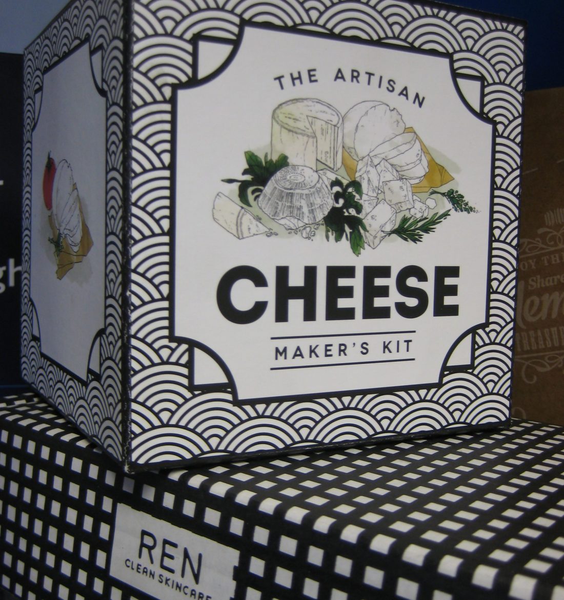
Belle Epoque, Paco Rabanne, Cowshed are three examples of well-known brands that have opted for black and white packaging. Of our customers, REN Clean Skincare, Serious Readers and Orient are amongst those that favour this classic combination.
Packaging Finishes
Monochrome designs can be lower cost than full colour printed cardboard packaging, but if you are aiming for sophistication, there are other ways to make an impact.
Colour isn’t the only packaging finish. Even with a limited pallet, great effects can be added with the use of embossing, spot varnishes and lamination. In addition, you have the design and manufacture of the box. Opt for product specific packaging, rather than an off-the-shelf option. Your commitment to quality is evident in the design.
Whether you favour vibrant colour, pastel shades or black and white packaging, Aylesbury Box Company is happy to discuss printed cardboard packaging options. We can advise on techniques, colour match to your branding and provide samples to help you make the right decision. Just get in touch with our team on 01296 436888 or email sales@abcbox.co.uk.
Sorry, the comment form is closed at this time.